When the internet first went live, websites served very basic purposes. These basic websites had basic functionality and developers didn’t have a lot of tools to work with. Common features of these sites included bright colours, flashing letters, low-quality images, and a limited selection of fonts.
As the internet has evolved, so too have the tools and functionality available to websites and web developers. That being said, some people are still living in the past when it comes to the design of their websites. Here are a few examples of outdated designs that are still being used today.
Let’s look at a couple of these sites now. keep in mind these are still active on the internet to this date.
It’s not bad when you are required to scroll vertically on a website. But one quality everyone can agree on is no one wants to scroll horizontally. Unfortunately, This website has decided this was the best method for the user to view the website.
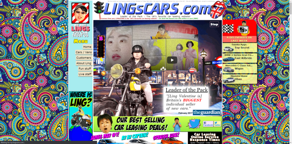
With poor grid and the navigational structure combined and the overwhelming content, graphic, random colour themes make this site look like a Silly Sollys catalog.
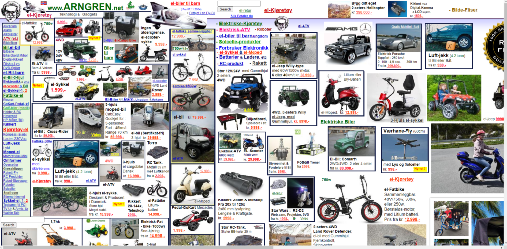
This site has taken a page from the book of the previous site. But rather than overstimulate the user with images, they have completely bombarded with a wall of text and an overload of information on the homepage.
A few small, low-quality images are scattered throughout the page just to ease your eyes from the overwhelming text.
The name is quite on the nose as the site itself is an actual wreck…… The site may have been designed by an actual pirate rather than a web designer.
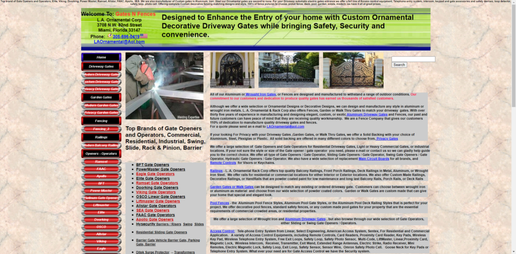
Hopefully, whoever uses this website has better navigation than this actual site. With numerous fonts, and random use of colours. But in that saying, I must take my hat off for this design rather than the previous two, it’s not overloaded with information and is a simple one-page.
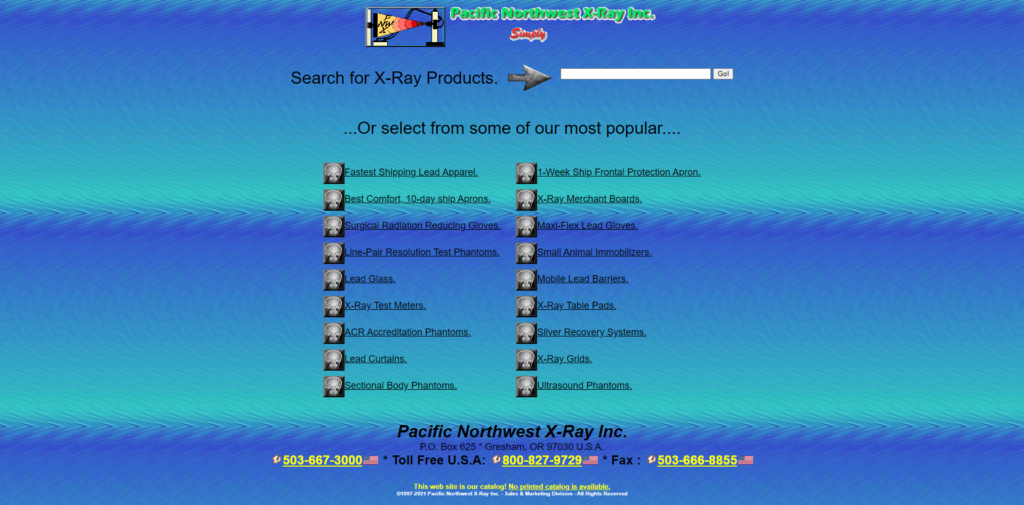
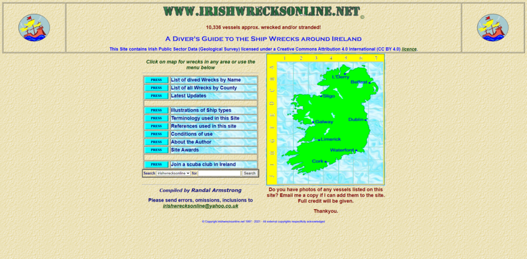
One function all these websites have in common is poor navigation, Pnwx.com is not any different with a labyrinth to navigate your way around the site. The conflicting background and text colours make it difficult for users to read and comprehend the text.
A good web design should have a decent and concise design with an interface that should be visually pleasing to the users’ eyes.